|
QVisu
Qt-based visualization for smart homes
|
|
QVisu
Qt-based visualization for smart homes
|
QVisu lets you display the status of your smart home. Contrary to other approaches like CometVisu and SmartVisu, it is not browser-based, but a program of its own. It is based on the QT5 framework, making it portable across a wide range of platforms.
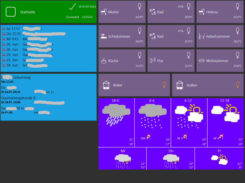
The look of the visualization is inspired by the Windows 8 tiles.
Currently, only Windows binaries are provided. Other planned targets are Linux x86 (Ubuntu) and Linux armhf (Raspberry Pi). Anyone is more than welcome to generate Android, Mac, iOS, or other versions.
This is a preliminary version, which is known to have bugs. As it does not write anything to the local disk system (with the exception of the Google calendar element, which writes some values to the registry), it should not cause any major damage to the device it is running on. Still, you use it completely at your own risk. It can and will interact with your home automation, where it can potentially cause damage. You have been warned.
QVisu is licensed under GPL v2. The Websocket driver is licensed under LGPL v2.
QVisu is currently set up to be used with the websocket driver of smarthome.py. The driver should also work with the smartvisu driver of openHAB, but this is untested.
A KNX driver (which would not require an explicit backend like smarthome.py) is also planned, but not exactly a top priority.
All configuration of QVisu is done in an XML file. The XML file has the following structure:
qvisu
  +- connection
  |
  + dimensions
  | +- w
  | +- h
  |
  +- path
  +- path
  +- ...
  |
  +- container
  |   +- element
  |   +- element
  |   + ...
  +- container
  |   +- element
  |   +- element
  |   + ...
  +- ...
See the included qvisu.xml as an example. The elements are described below.
<connection>Required
Describes the backend. Currently the only supported type is smartvisu.
<connection type="type" log="logfile">server:port</connection>
| tag | comment |
|---|---|
| type | Must be smartvisu |
| log | Optional. Log the data stream from the backend to logfile. Seems to be broken. |
| server:port | Your smarthome.py backend |
| type | Must be smartvisu |
| log | Optional. |
| server:port | Your smarthome.py backend |
<dimensions>Required
The elements of QVisu are aligned in a grid. With the sub-elements w and h, you define the grid size (w for width, h for height). QVisu will try to fill the screen with the grid, preserving the aspect ratio. When changing devices, you might need to change the grid dimensions.
Most elements are 2x2, so on a 16:9 monitor, w=16 and h=9 might be a reasonable starting point.
<dimensions>
    <w>width</w>
    <h>heigh</h>
</dimensions>
| node | comment |
|---|---|
| w | Width of the grid. |
| h | Height of the grid. |
<path>Optional
Defines the search paths for external files (mainly image files). If you have placed your SVG images somewhere else than the directory you are starting QVisu from, this is helpful.
You can use any number of <path> entries.
<path>Search Path</path>
<container>Required
The container is the central grouping element in QVisu. All elements which are inside a container are displayed simultaneously. Only one container is displayed at a time.
There are no special restrictions on container names (except that they must be unique). However, there are two special container names:
<container name="name">
    <element>...</element>
    <element>...</element>
    ...
</container>
| tag | comment |
|---|---|
| name | Container name |
<element>The functionality of QVisu is contained in its elements. Currently, the following elements are available:
See the element-specific pages for more details. If you find out how to link directly to these pages in Doxygen 1.8.6, let me know.
<element type="element type" position="x,y" width="w" height="h">
    ...
</element>
| tag | comment |
|---|---|
| element type | See element-specific description |
| position | Defines the upper left corner in the grid. Make sure the element is completely inside the grid, otherwise placement will fail |
| width | Width of the element. May be overridden, depending on the element. |
| height | Height of the element. May be overridden, depending on the element. |
Some element types might define additional tags.
Data values in QVisu are called items (as they are in smarthome.py). There is no particular naming convention for items, but the item names should match those which you use in your backend (typically smarthome.py).
When you change an item in QVisu (e.g. by pressing a button), it is updated in the backend. When an item is sent from the backend, the value is distributed to all elements and displayed by those where it is specified in the configuration.
QVisu generates a number of internal items, which can be displayed as any other (but should not be modified by elements):
#time - current time in hh:mm format#time-seconds - current time in hh:mm:ss format#date-de - current date in dd.mm.yyyy format#date-int - current date in yyyy-mm-dd format#date-de-weekday - current date with weekday in dd.mm.yyyy format, e.g. Mo 06.07.2015#date-int-weekday - current date with weekday in yyyy-mm-dd format, e.g. Mo 2015-07-06You have two ways to specify a color:
#xxxxxxxx color code known from HTML. #FFFFFF is white, #000000 is black.
The font color is calculated based on the gray tone (i.e. brightness) of the background. On light backgrounds, it is set to black. On light backgrounds, it is set to white.
QVisu only supports SVG graphics. Pixel graphics like PNG, JPG, GIF, ICO are not supported.
Icons which represent a status (i.e. on/off) can be specified in a number of ways.
The easiest way is simply
<sw-icon>my_icon.svg</sw-icon>
In off-state, QVisu will then display the icon as-is. In on state, it will try to recolor the SVG to orange.
You can specify two icons for on and off state, simply separated by a comma:
<sw-icon>icon_off.svg,icon_on.svg</sw-icon>
Automatic recoloring:
<sw-icon color="..." active-color="..." color-mode="...">my_icon.svg</sw-icon>
| tag | comment |
|---|---|
| color | default icon color (when off). Default is white. |
| active-color | icon color in on mode. Default is orange. |
| color-mode | Advanced use only, see below |
color-mode states how the color inside the SVG is modified:
 1.8.8
1.8.8 
